Brand Core & Visual Identity Development
Case Study:
Hearthstead Branding
Context (Inside the Jar)
Hearthstead didn't exist yet when the Founding Executive Director came to me for support with creative. This was a new organization finding its voice and mission, which was helping women and families remember belonging – to food, earth, seasons, their own bodies, each other. It needed to become something nameable and visible for the first time, from the name up.
Creative Direction
I developed a comprehensive brand strategy through:
Collaborative naming development, landing on Hearthstead
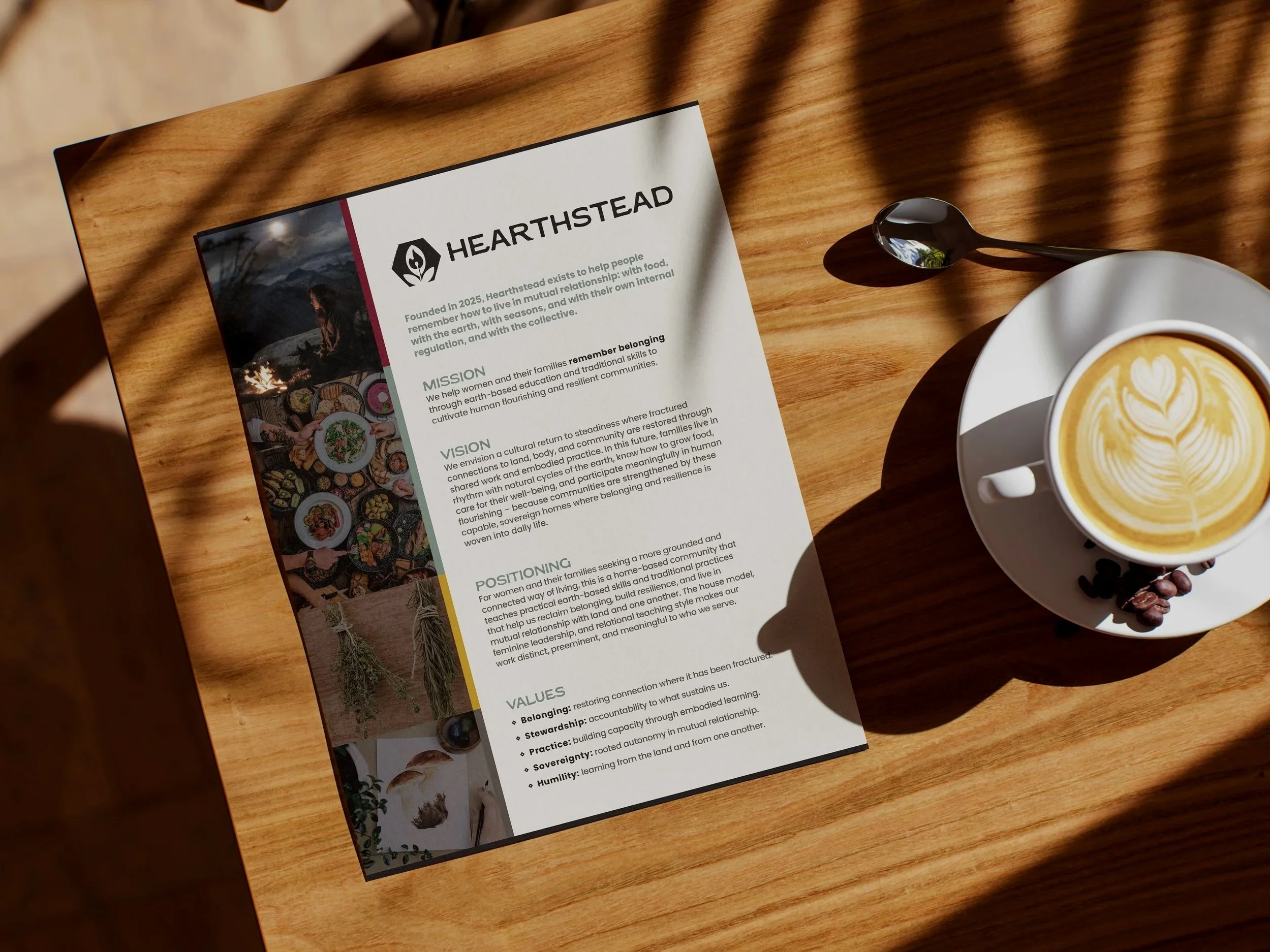
Brand core development: mission, vision, positioning, and a five-value framework
A symbolic visual identity system anchored in elemental meaning
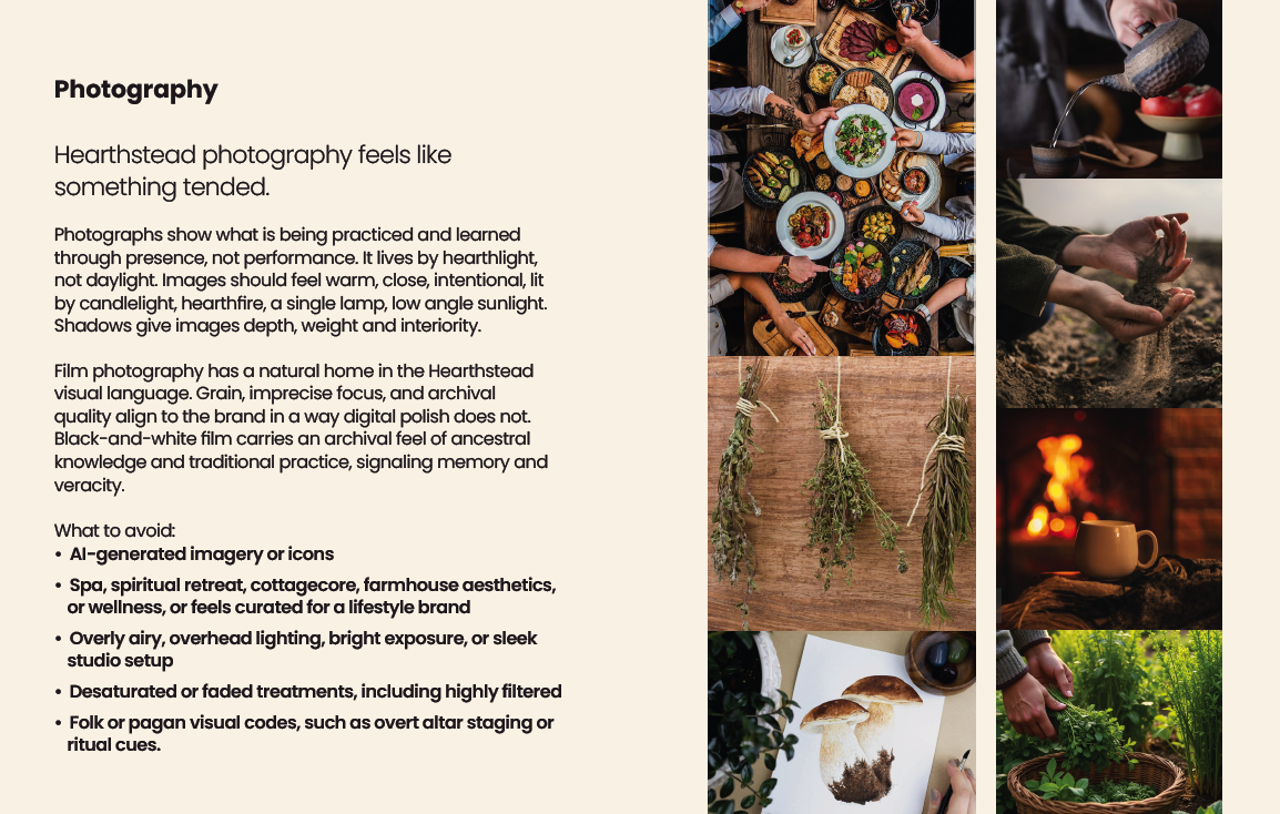
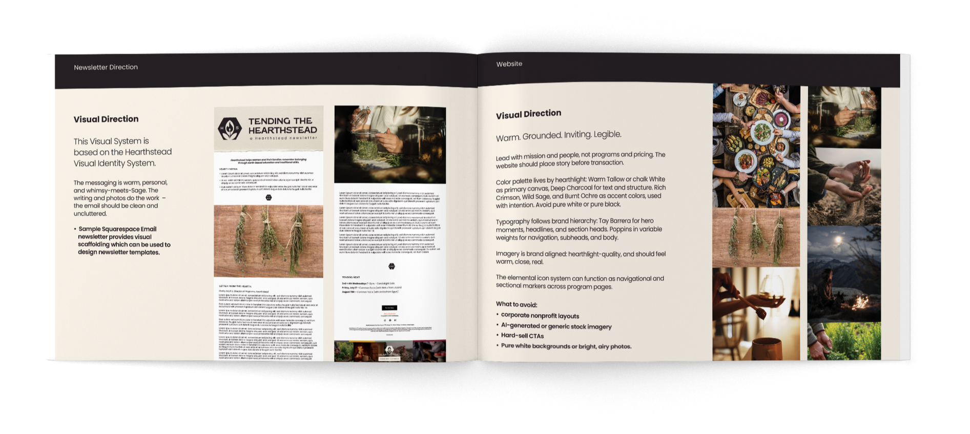
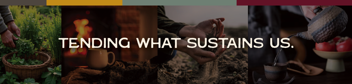
A distinct photographic and voice direction, lit by "hearthlight, not daylight", built specifically to keep the brand out of wellness/cottagecore/trad wife territory
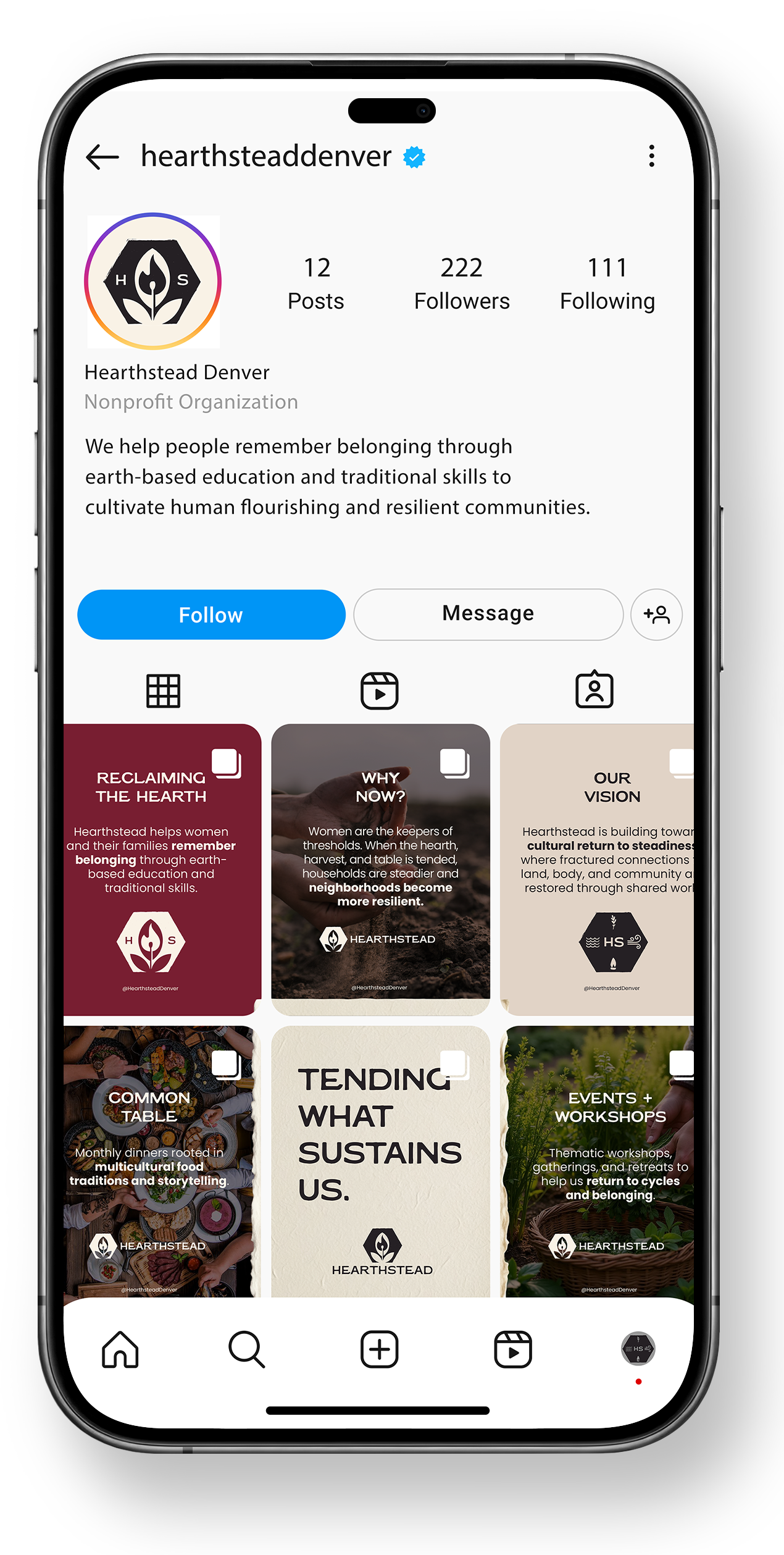
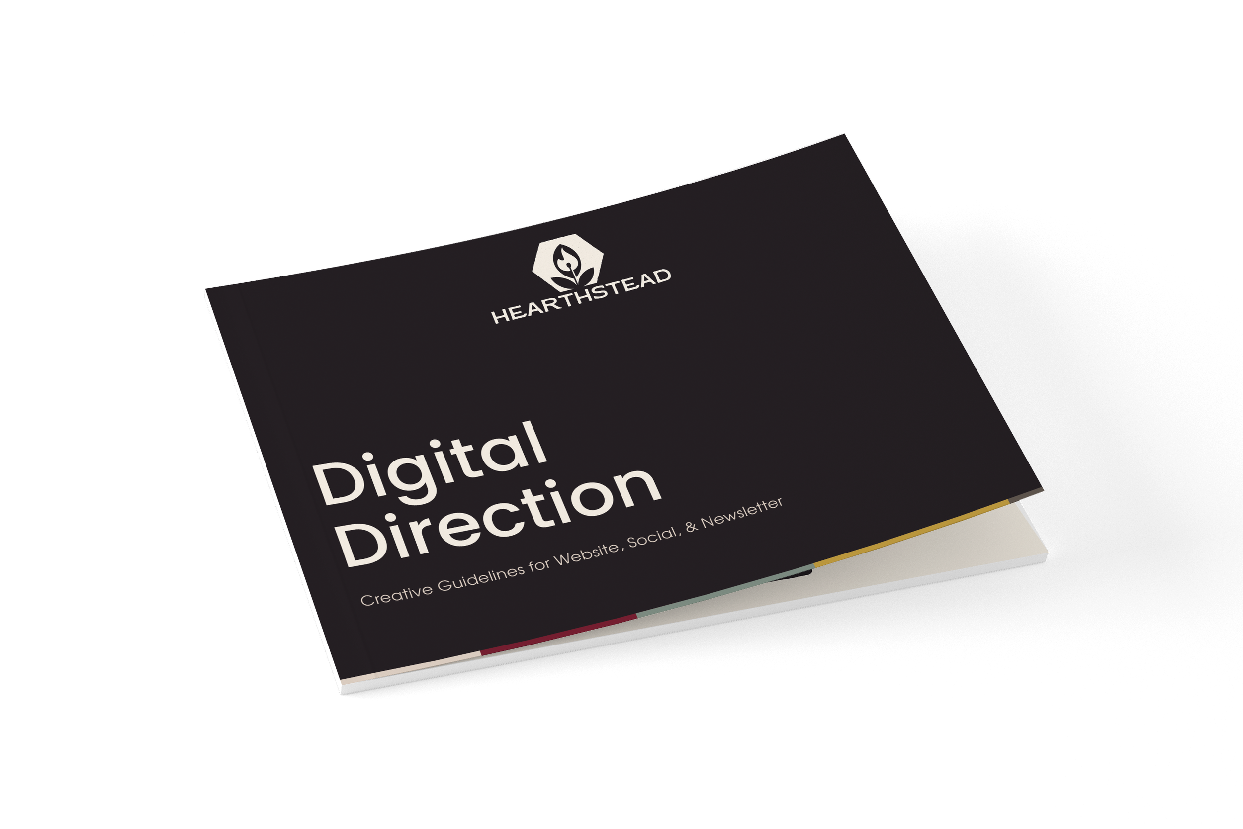
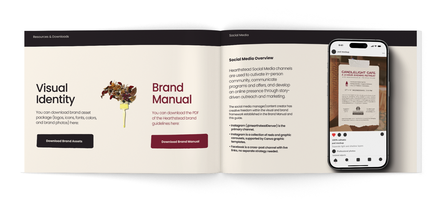
Full digital direction extending the same system to website, social, and newsletter
Creative Solutions
Comprehensive name exploration process: Hearthstead is rooted in the oldest organizing principle of human civilization: the hearth, the center around which all of life was tended
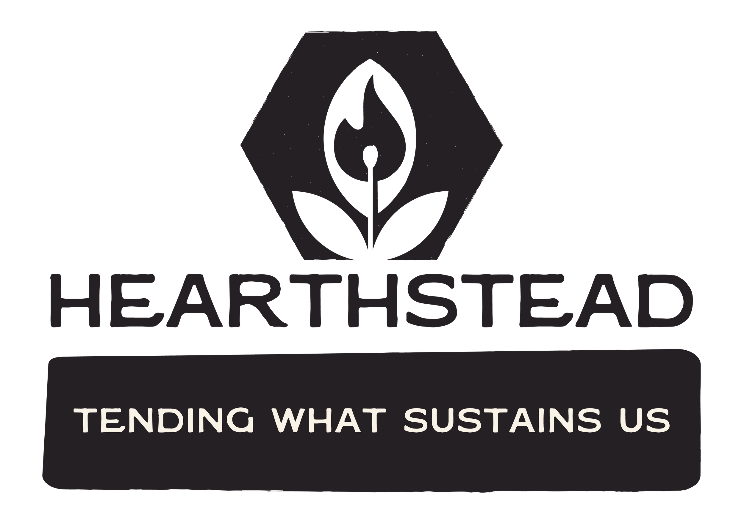
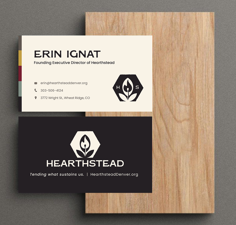
Logo system: a flame rising from a match inside a leaf, held in a hexagonal seal — fire as tended knowledge, the botanical as earth-based practice, the seal as covenant, something pressed and permanent. Primary vertical and horizontal marks, plus a secondary hexmark for merchandise and profile use
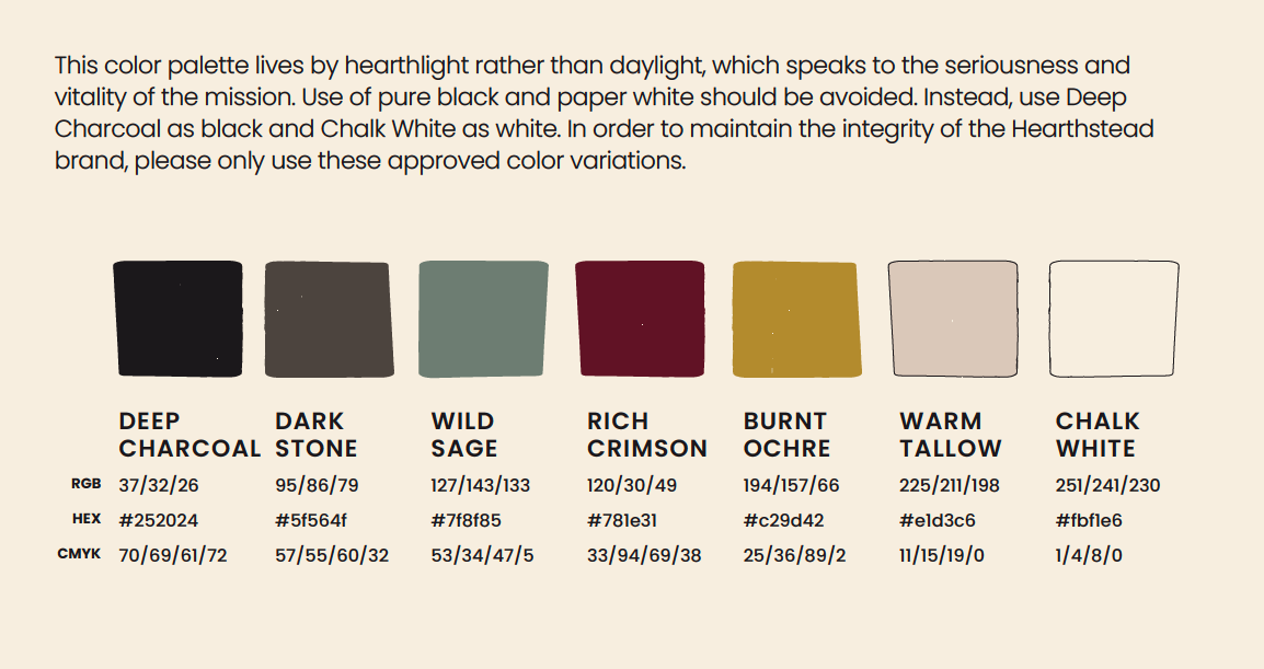
A six-color "hearthlight" palette (Deep Charcoal, Dark Stone, Wild Sage, Rich Crimson, Burnt Ochre, Warm Tallow/Chalk White) — deliberately avoiding pure black or white
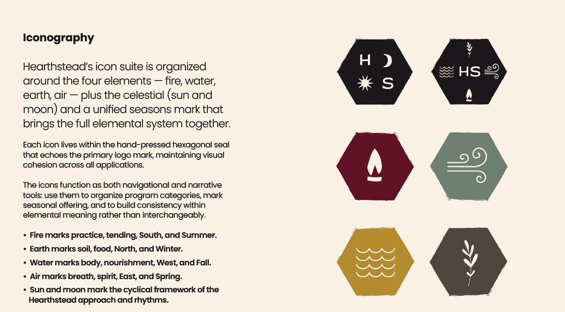
A six-icon elemental suite (fire, water, earth, air, celestial, seasons) functioning as both navigation and narrative device across programs
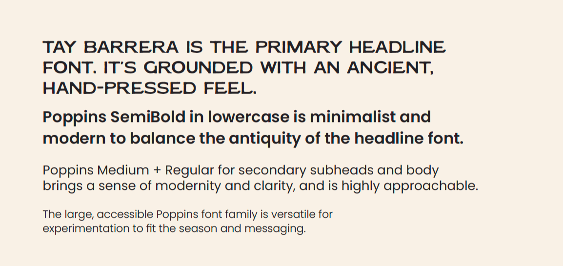
Typography pairing an antique, hand-pressed headline face with a modern sans for clarity and warmth, feeling pressed and permanent
Full Digital Direction deck: website structure and copy tone, Instagram content pillars, and a monthly newsletter format ("Tending the Hearthstead")
Refined print suite including business essentials: one-Pagers, brochure, and business cards
“Shelby’s work in storytelling, design and content production is exceptional. Her ability to weave a story with a sharp eye for detail, clarity, and beauty makes her the clear choice to create something that is both beautiful and impactful.
Shelby is an asset to any project and collaboration she commits herself to… an excellent investment. ”
–Erin, Founding Executive Director of Hearthstead
Impact
The ground-up, story-driven brand provides Hearthstead with:
A complete brand identity launched from nothing — name, mark, system, and voice built to work together from day one
Consistent visual language across every touchpoint: print, web, social, email
A foundation ready to support Hearthstead's programs as they launch and scale
A values-forward system built to carry matriarchal work into a hungry world.
Hearthstead is ready to build on top of a strong identity and branding as they help people remember belonging.